All together now…
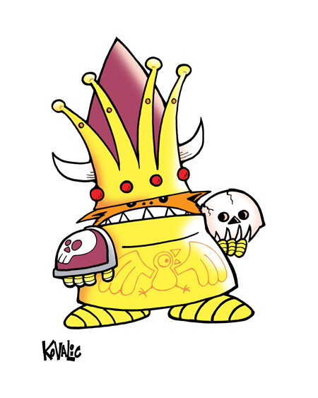
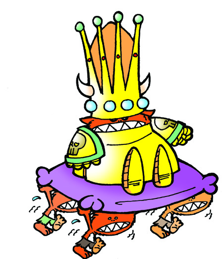
Believe it or not, I think this is only the second time I’ve drawn King Torg, that lovable, berserk bundle of orange brutality who leads the Kobolds through a cunning combination of violence, violence and more violence.

Here’s the first drawing I did of him, from the Kobolds Ate My Baby Super Deluxx Edition, seven years ago.

Obviously, not much has changed. I still love the basic character design work I did, when we reimagined the Kobolds for SDE. But going into King Torg for the new Kickstarter edition, I really thought I’d want to change him, more. But even in the initial sketches, I realized I still kind of loved the big ‘ol ball of unrestrained Kobold brutality.
Some of the colors were tweaked, and a few details added. One or two more may yet come into play. But the biggest change? Line quality.
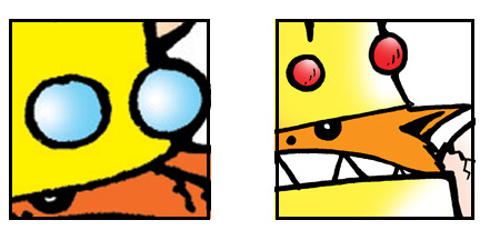
Line quality may not seem hyper-important to the non-cartoonists, out there. But trust me – I used to use terrible, terrible pens, once upon a time. Because they were cheap. And they were quick. And they were easy. As easy as inserting a joke about the girls I dated in college at this point. Which I won’t. Because. You know. PRIDE.
These days, I favor black Faber Castell Pitt Artist pens, and I can’t recommend them highly enough. Yes, the original line drawing for the new King Torg drawing is larger than the original I did, all those years ago. But look at the difference in quality anyway:

Yeah…that first one still gives me nightmares.
I could go on about line quality for hours. For the moment, though, I hope you see why I’d like to pack the new Kobolds Ate My Baby! In Color!!! edition full of as much new art as I can.


